What changed
The move to Emhance solved the naming problem cleanly. It brought together emotion and enhance in a way that better reflected the company\'s work and gave the brand a name people could understand, repeat, and carry forward more easily.
Brand / Web / Positioning
Sensemitter had reached the point where the name was getting in the way. It was awkward to say, hard to remember, and no longer matched what the company actually did. The product was about emotional engagement, not senses, and the identity needed to catch up with that reality. I led the marketing side of the rebrand and helped turn the new name, message, and website rollout into a clearer fit for the same company.
The move to Emhance solved the naming problem cleanly. It brought together emotion and enhance in a way that better reflected the company\'s work and gave the brand a name people could understand, repeat, and carry forward more easily.
A big part of the task was aligning the brand across the C-suite, investors, and internal stakeholders so the new identity did not just look better but made the company easier to explain consistently. The rebrand had to work upward, outward, and internally at the same time.
The core logic was simple. A name should be easy to remember and easy to share. Sensemitter was doing neither especially well. Emhance was a better fit: more legible, more relevant to the company\'s focus on emotion AI, and better suited to the way the business needed to present itself to customers, partners, investors, and the wider market.
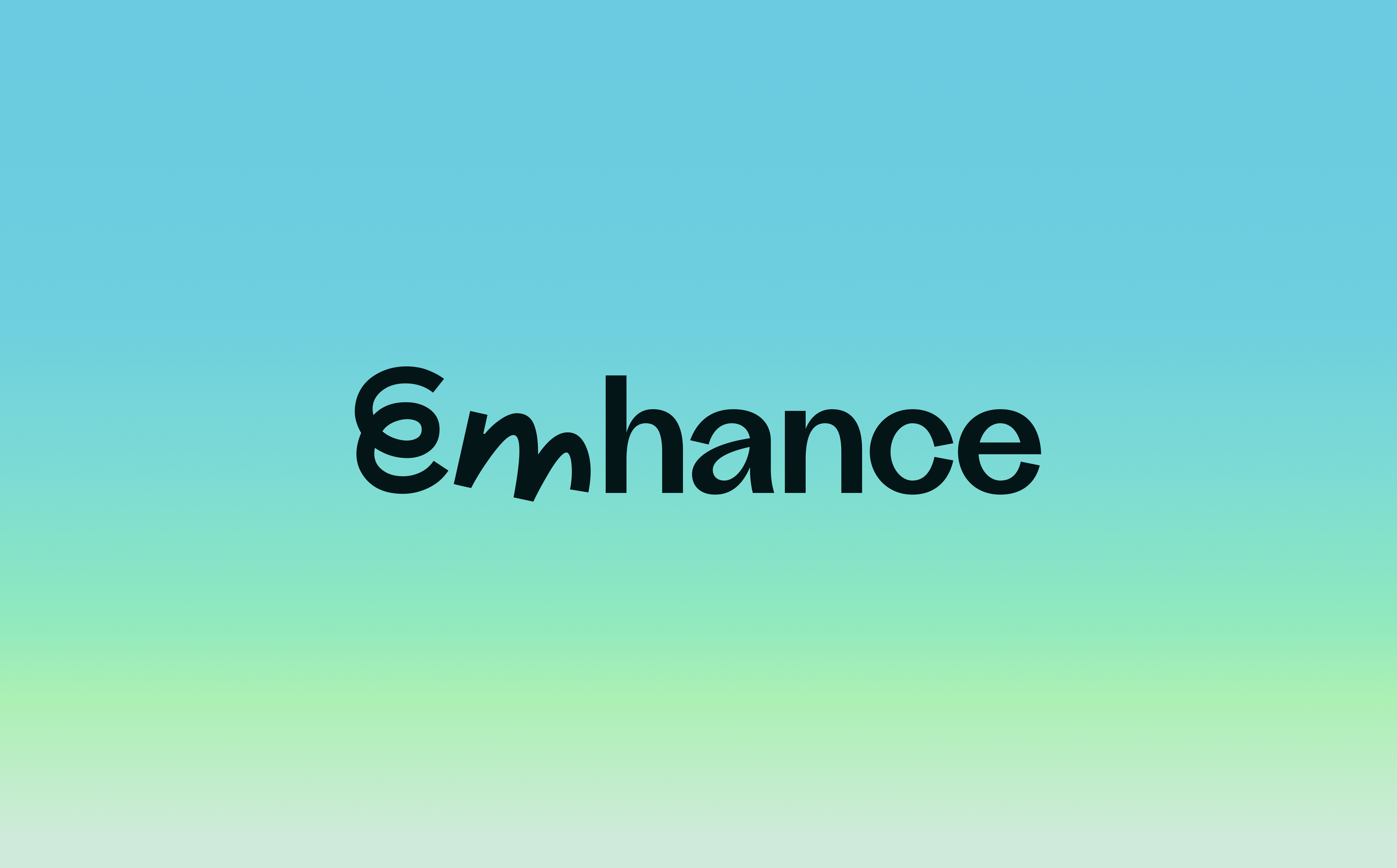
The playful m in the logo helped signal that this was a company working with games and game-makers, not a dry enterprise software brand pasted into the category. The different treatments of the m, warped into different emotional states, pointed toward the secret sauce of the technology itself: using AI to show how players really feel, not just what they later say in surveys or interviews.
The groundwork on my side was about aligning the messaging to the business case we present to clients. That meant focusing less on novelty and more on the outcomes game teams actually buy against: stronger retention, better LTV, and a clearer understanding of how emotional engagement connects to commercial performance.
My part of the work was making sure the rebrand held together in practice. That meant carrying the new identity through web copy, brand usage, and the broader company story so the rollout felt coherent. The rebrand needed to read as a better fit for the same team and technology, not as a break from what already worked.
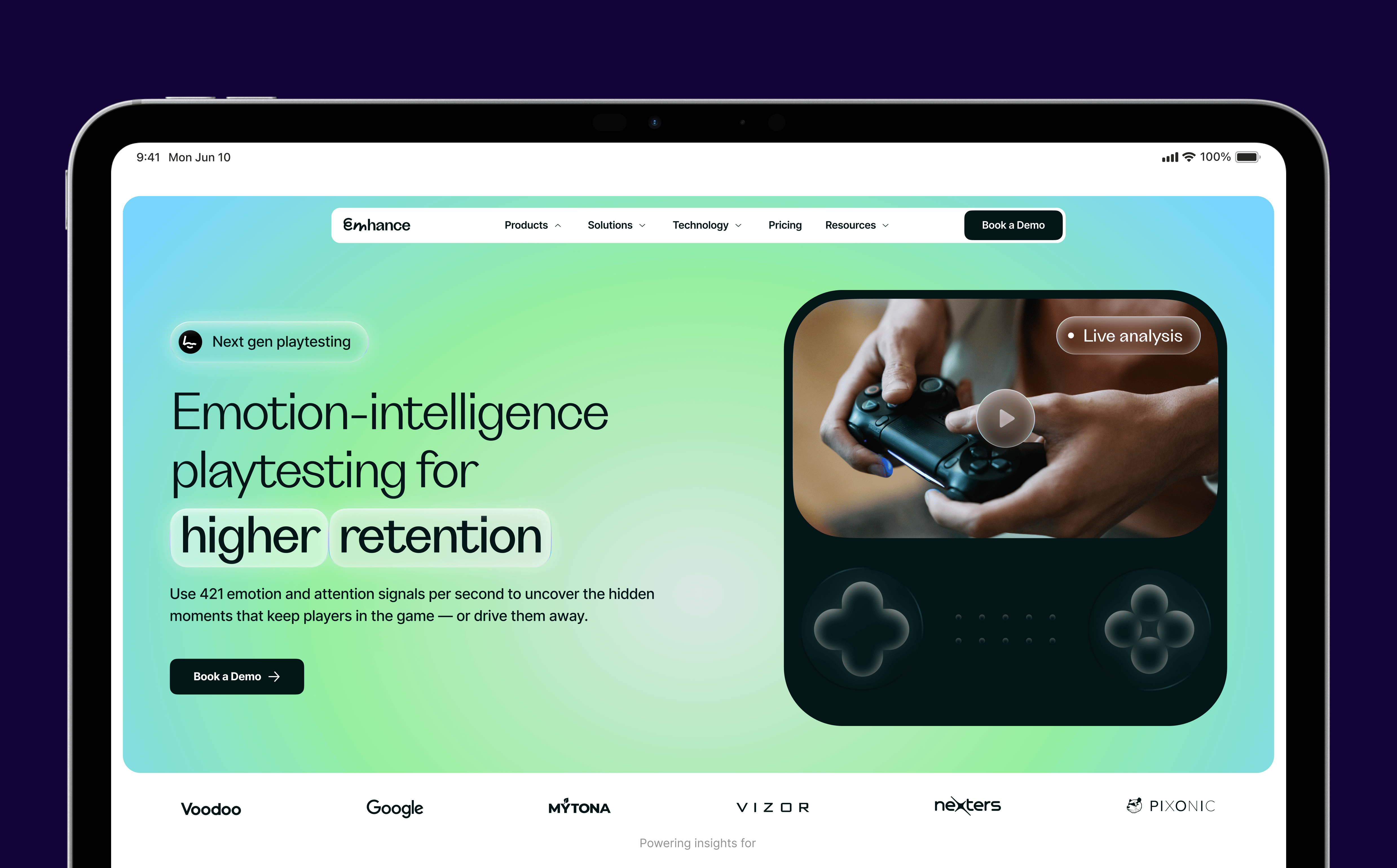


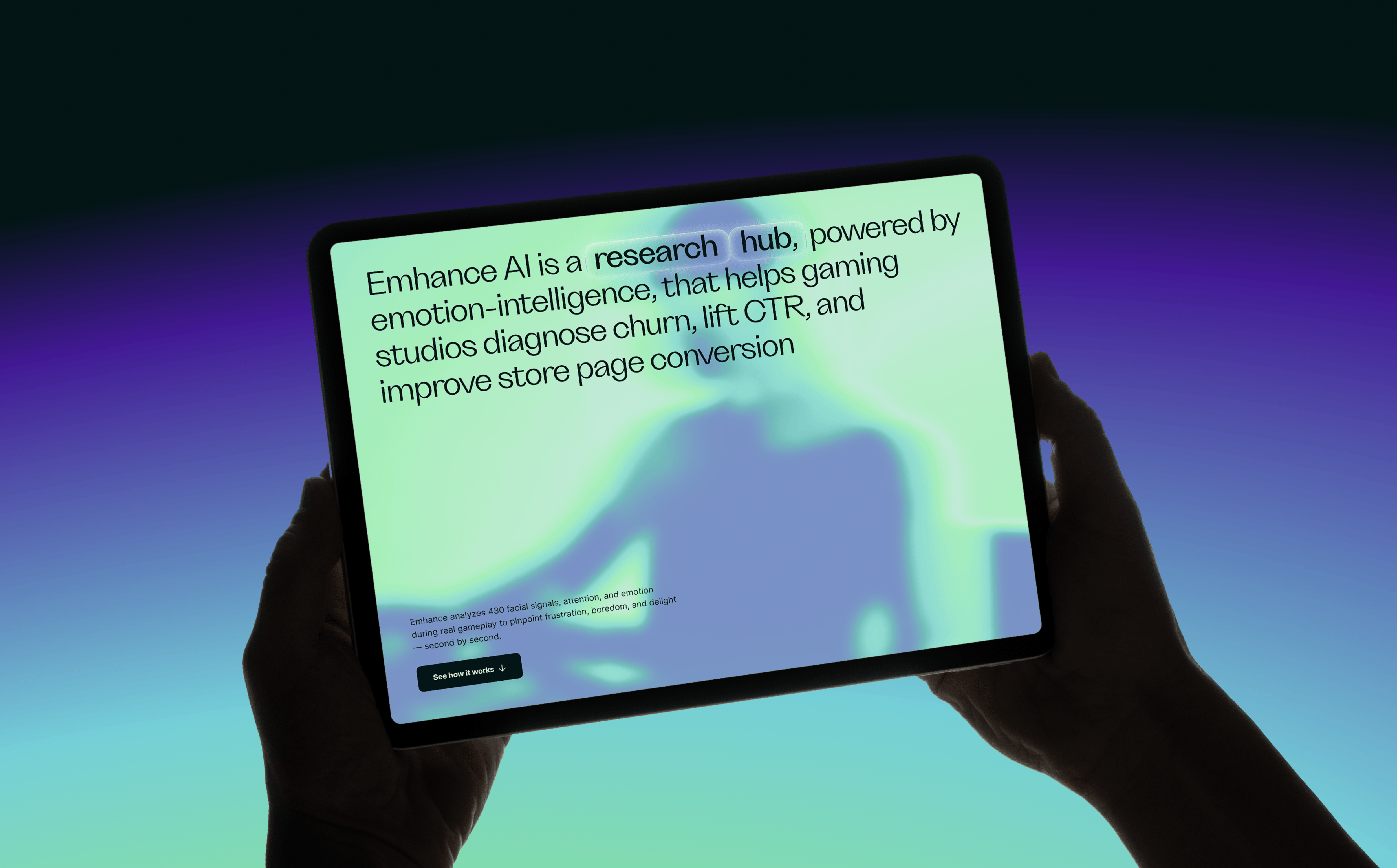
The public announcement made the logic explicit: same team, same technology, same commitment — just an identity that fit properly. That clarity mattered. It let the company explain the change without making it sound like a pivot, while still signalling a more mature and scalable brand to the market.